
Salesforce continues to expand the capabilities of Screen Flows, making them more powerful, flexible, and user-friendly than ever. From new flow types and triggered automations to enhanced styling, navigation, and components, the Spring ’26 release brings a host of updates designed to streamline automation and improve the user experience. In this article, we’ll walk through the latest features, share tips on how to use them effectively, and highlight a few areas where you’ll want to tread carefully.
Who benefits from this article? Salesforce Functional Talent: Administrators, Architects and Consultants
What can you expect as an outcome? An understanding of the new Flow features in the Spring 2026 Release
You can watch the video version here and follow along below depending on your learning preference.
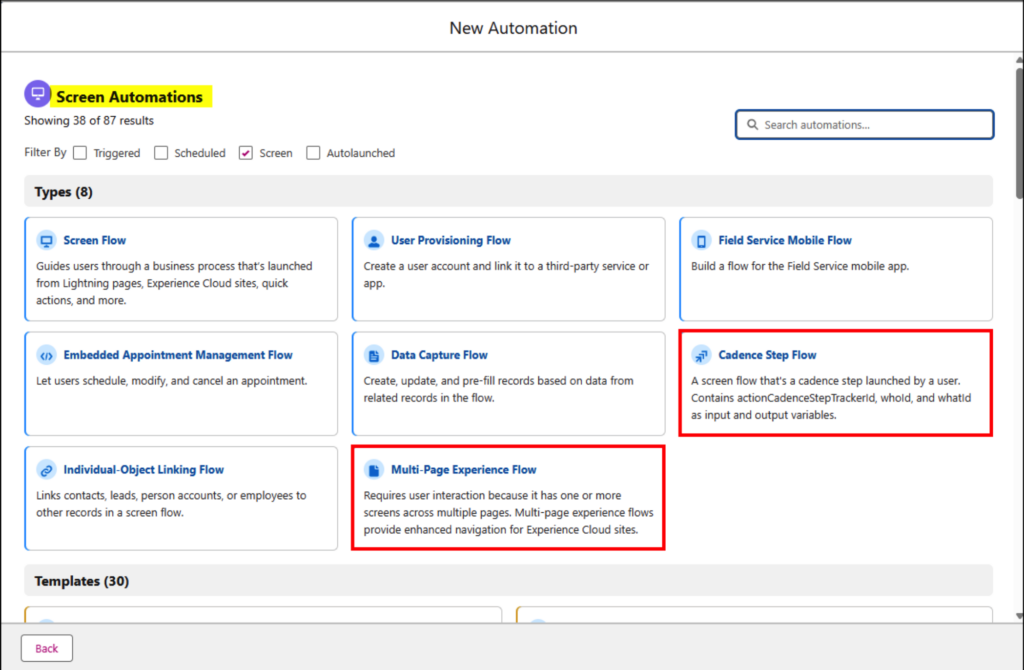
To Begin We Have 2 New Screen Flow Types
Salesforce originally introduced two additional Screen Flow types. The Cadence Step Flow and the Multi-Page Experience Flow.
- Cadence Step Flow – The Cadence Step Flow was built to support users as they work through cadence steps within a sales process.
- Multi-Page Experience Flow – The Multi-Page Experience Flow aimed to improve navigation and create a more seamless journey for Experience Cloud users, though this capability was later pulled back.
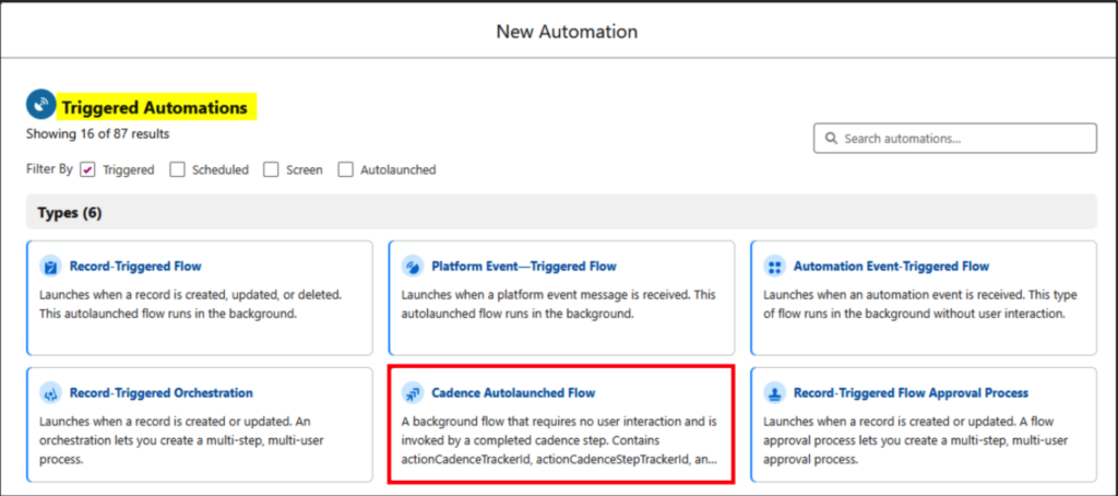
The New Cadence Autolaunched Flow
A new triggered automation type was also introduced: the Cadence Autolaunched Flow. This is a background process that runs when a cadence step is completed, tying directly into the sales cadence workflow by firing automatically at the end of a step.
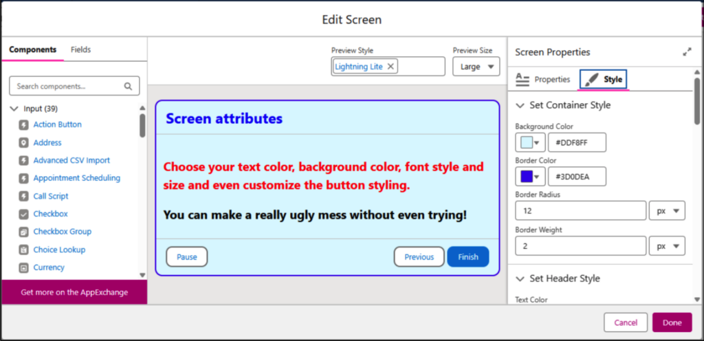
Screen Flow Styling
In Spring ’26, Screen Flows gain expanded styling options. You can now customize elements like background and border colors, border radius, font family, size, and color, along with adjusting the look of the Next, Previous, and Pause buttons. Button states can also be styled for hover and selection.
Of course, with this level of control comes the risk of overdoing it, it’s very easy to end up with something visually chaotic if you’re not careful!
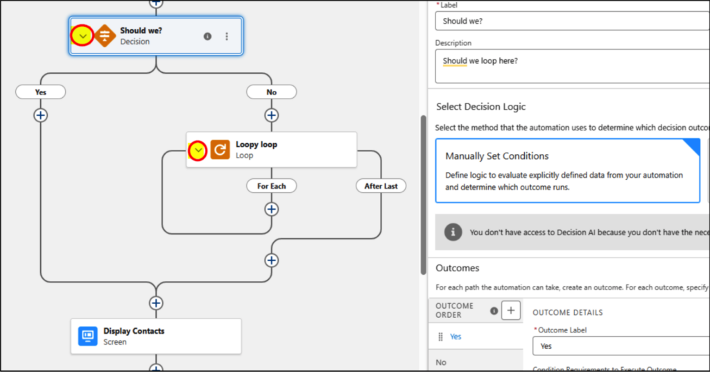
Collapse Components
To reduce visual clutter on the canvas and make navigation and debugging simpler, you can now collapse Loop and Decision elements using the small caret on the left side of each element (see image).
Navigation of the Flow Canvas
You can now move through your flows like this:
- Vertical Movements: Use your mouse wheel, the arrow keys, or the Page Up and Page Down keys.
- Horizontal Movements: Click and hold the left mouse button, then drag left or right to scroll across the canvas.
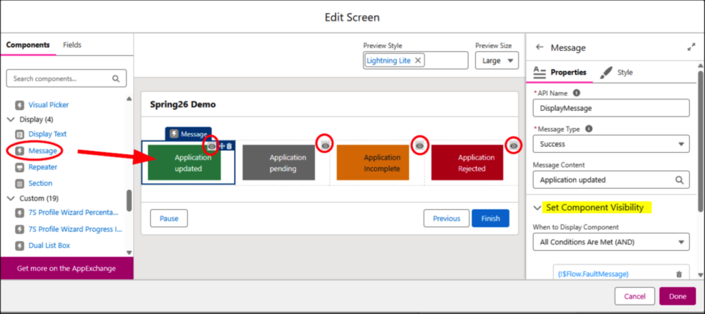
Flow Message
You can now use the Message component in a Screen Flow to present information like success, warning, or general informational notices. It offers four message variants with attributes similar to standard toast notifications. Pair it with Component Visibility to dynamically display the appropriate message when needed.
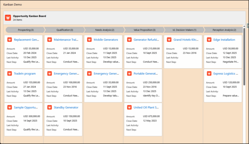
Kanban Board Component in Screen Flow
By adding the Kanban Board screen component to a Screen Flow, you gain more flexibility in how Salesforce records are visualized. You can include up to five fields, along with optional header and footer details. The board can display either a path-style indicator or a simple header at the top, and you can style the screen to align with your organization’s branding.
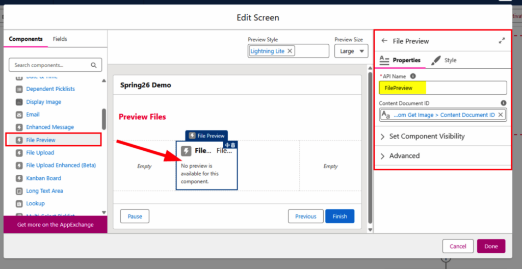
Preview Files
A new File Preview component is now available. By passing in the ID of a Salesforce File (Content Document), you can display supported formats like .png, .jpg, or PDF directly within the flow, eliminating the need to download or open the file outside the experience.
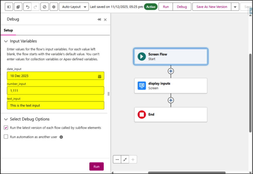
Debug Improvements
When you debug a flow, the values you enter for testing are now saved in your browser cache, so they’re automatically available the next time you run the debugger. There’s no need to re-enter them each time, and they remain even if you close and reopen the debug panel. This applies to both Screen Flows and Record-Triggered Flows.
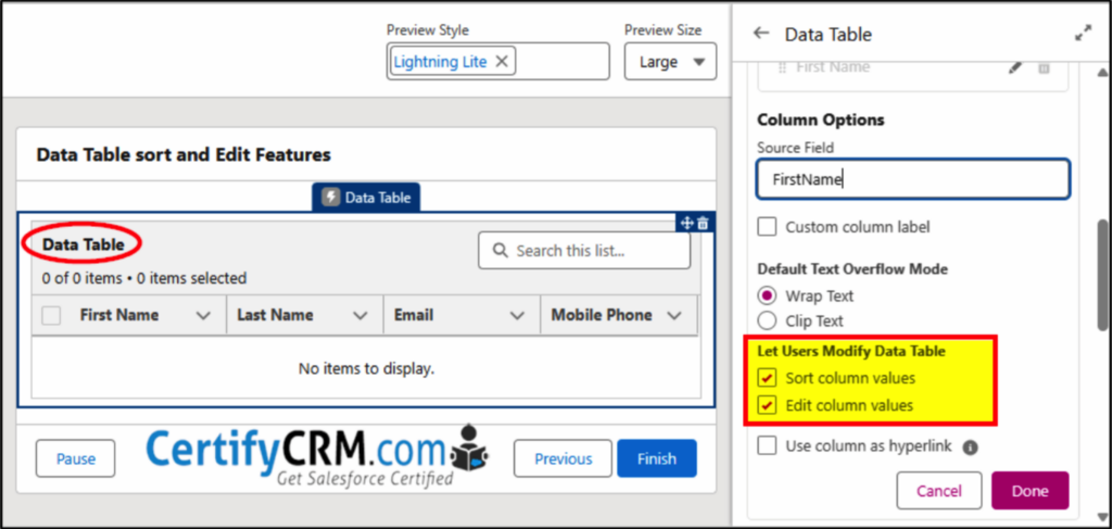
Data Table – Sorting and Inline Editing
The standard Data Table component now allows you to set sort order and perform inline editing — a very handy improvement.
You can also configure text or URL columns to act as hyperlinks.
Supported data types include:
- Boolean
- Number
- Currency
- Phone
- Percent
- Text
- Text Area
- String
- Integer
- Long
- Double
- Decimal
- Id
Note that Picklist values, lookups, and Date/Time fields are not supported.
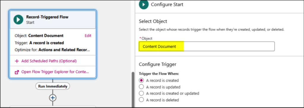
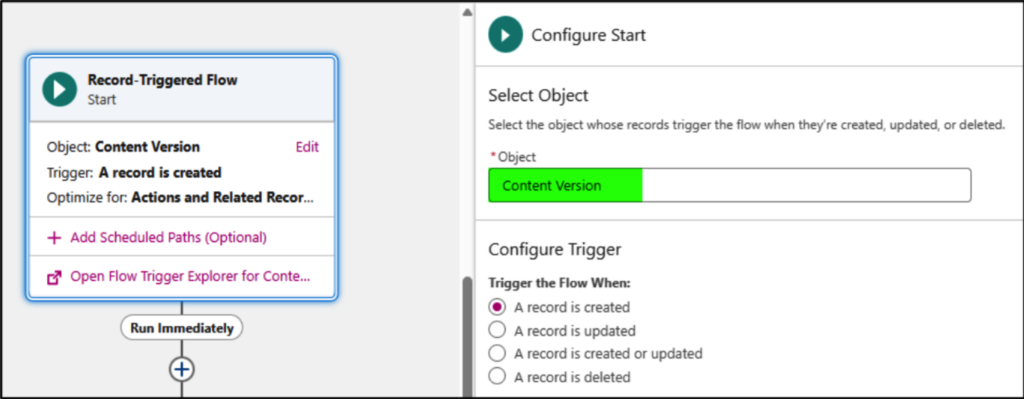
Trigger Flows on File Creation
Flows can now be triggered on Content Document and Content Version objects, allowing automation to run directly on Salesforce Files.
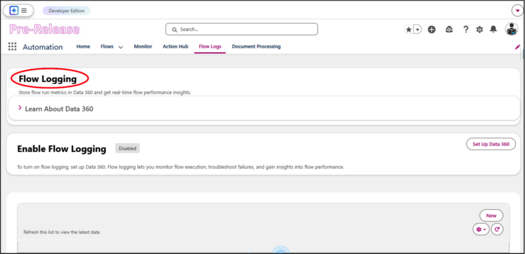
Flow Logging
If your org has Data 360 (Data Cloud*) enabled, you can capture and log metrics for every flow run. This includes details like completion time, status, and errors, and you can enable or disable it for each flow individually. Keep in mind that using this feature consumes Data Cloud credits. It’s accessed through the Automation app.
*Note: Data Cloud cannot be installed in an existing Developer org.
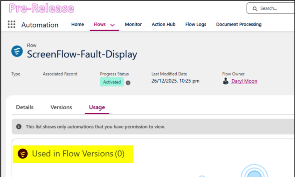
Flow Usage
In the Automation app, the new Flows → Usage tab is meant to display where a flow is being used. For example, I have a screen flow called ScreenFlow-Fault-Display that’s invoked by several other screen flows to handle faults, yet the tab doesn’t show its usage across those flows. This might just be an early glitch that will be resolved in a future update.


